31 October 2007

Book Review: Beautiful Landscapes by Diane Wright


Diane Wright (2007) Beautiful Landscapes. Walter Foster.

It's the last day of October, so just time for one last Big Draw Book Review. This will be a quick one, but as I've only just received the book from Amazon, I can't resist it.

Diane Wright is an extremely accomplished graphite artist, rather in the mold of Mike Sibley, the subject of my previous review. Indeed, Diane is a great admirer of Mike's work, and considers him to be her mentor. Therefore, the style of work shown in the two books is very similar. However, Diane's book is a very slim volume, just 64 pages, and can be picked up very cheaply ($9.95 direct from her web site). In a sense, then, it is an "entry-level" version of Sibley's book, though this description doesn't give Diane enough credit as a fine artist in her own right.

As the title indicates, this book focusses entirely on landscape drawing. The first part of the book is devoted to drawing major landscape elements, with particular emphasis on trees. Diane's tree drawings are a delight in themselves, and I personally would love to have a book of hers devoted entirely to this subject. In fact, you can follow a tree tutorial on her website, and also find it in the Drawing and Sketching forum on WetCanvas!

The largest part of the book, however, consists of Diane taking us step-by-step through a series of wonderful drawings of subjects as diverse as Kirkwall Harbour and the Sonoma Desert. The book is worth many times more than its price just to look at the finished drawings, but the advice contained in them is invaluable. I haven't had the chance to read through the whole book in detail yet, but I'm sure it will repay careful study.

Diane is a lovely person, as well as a great artist. I hope this book does very well for her; it would certainly do very well for your art! Highly recommended.

21 October 2007

Book Review: Drawing from Line to Life by Mike Sibley

Mike Sibley is a well-known British graphite artist. His book, Drawing from Line to Life, was published last year. To his many fans, this was a long-awaited event, and it created a lot of excitement. The book even has its own Yahoo group. For anyone interested in graphite drawing, especially in a realistic style, this book will provide a feast of information. There is bound to be something new to learn for everyone as Sibley is a very experienced artist who has developed many tricks over the years. I have to admit that I don't particularly like his art, but one cannot fail to admire his technique.

The book has twenty-four chapters.
The first set deal with tools and techniques, including line drawing, tone drawing, erasing and indenting. Sibley's own technique is sometimes surprising, but always clearly explained. Here, for example, is what he says about blending.

Personally I wouldn't entertain the use of foreground blending except in circumstances where the texture produced is exactly the one I wish to depict. Such exceptions include muddy or dusty floors, uneven plastered walls, anywhere that doesn't include sharp edges or hard shadows. The slap floor and walls in this Bearded Collie study are totally blended - in fact much of the 'detail' was drawn with an old graphite-coated tortillon. Graphite, mainly 2B and F in this case, was repeatedly applied to the floor and blended until I achieved the desired appearance. The initial blending was carried out with a piece of toilet tissue wrapped around my finger.

The section ends with a step-by-step demonstration of a drawing of a young girl. This is very useful, with many detailed descriptions of technique and detail view of the work in progress, such as this one showing the technique he uses to render hair.

When I wrote that the first part was about technique, I may have given the impression that the other parts of the book were about something else! In fact, section two is also about technique, though perhaps more advanced. It includes chapters called Fooling the Brain, Working from Photos, Negative Drawing and Perspective. Interestingly, Fooling the Brain deals with some of the tricks discussed in Betty Edward's Drawing on the Right Side of the Brain, in particular the use of negative drawing. This technique is something of a Sibley specialty, and the chapter devoted to this method is one of the highlights of the book.

The final set of chapters deals with drawing particular elements of a drawing: ellipses, textures, reflections, foliage, hair and features. This may well be my favourite part of the book. The chapter on trees and foliage is especially good; but that might just be because I draw a lot of trees! Here is some of Sibley's advice.
There are three major aspects of a tree that are important to its appearance - surface texture and shape, internal bough structure, and gaps through which you can see through to the other side. A tree is not an amorphous collection of leaf-shaped items or random marks that, you hope, will fool a viewer's brain into reading as 'tree'. A tree is an ordered, layered object with an outer covering around an inner armature or core. It's only by analysing what you see that you will gain the full understanding that allows you to draw realistically.
You can't argue with that! The book is 287 pages long, and contains far too many illustrations to count. I find I am constantly dipping in to it to get ideas, advice and inspiration. For example, I'm off to look at the chapter on drawing hair before going back to my drawing of Jonathan! I can't recommend it highly enough.

Oxford Art Society

Yay! My drawing was accepted by the Oxford Art Society for their annual Open Exhibition. It was on the blog a few months ago: you can see it here. I know this isn't really a big deal in the great scheme of things, but I'm very excited. I've never had a picture exhibited anywhere before; in fact, I've never submitted anything before. I went to the private view yesterday, and I have to say, I don't think my modest little drawing looked totally out of place among all the works by professional artists. No one seemed to be laughing at it, at least! So, if you happen to be in Oxford before 3 November, stop in and see it.

17 October 2007

The Big Draw Book Review: Drawing by Daniel M. Mendelowitz


This review is inspired by Katherine Tyrell's (of Making a Mark fame) October Book Review project, timed to co-incide with the Big Draw in the UK.

This book was first published in 1967, and is now out of print, but you can find used copies on Amazon and elsewhere. The author, who died in 1980, was on the faculty at Stanford University for over 30 years, having himself studied at Stanford and also at the Art Students League of New York. Although Mendelowitz taught drawing at Stanford, and aimed this book at art students, it is not a "how to" book of the sort that we have become used to. Rather, it is a tour of the history of drawing; meant to be inspiring rather than instructing.

The book is over 450 pages long and contains over 300 illustrations of masterful drawings, many familiar but also a large number of more obscure pictures. It inspires by reminding us of the sheer variety of possibilities encompassed by "drawing." It was the most important single thing that finally made me do what I had wanted to do for a long time: begin the lifelong process of learning to draw.

The book consists of three main sections. The first is a history of drawing, starting, inevitably, with cave drawings and finishing in the middle of the twentieth century. I have read some reviews of this book written in the academic literature soon after it was originally published, and they are rather sniffy about this section, perhaps because Mendelowitz was not an art historian. To someone who, like me, is not an art historian it is wonderful to be guided through the major developments in the history of drawing by someone who is so obviously in love with this form of artistic expression.


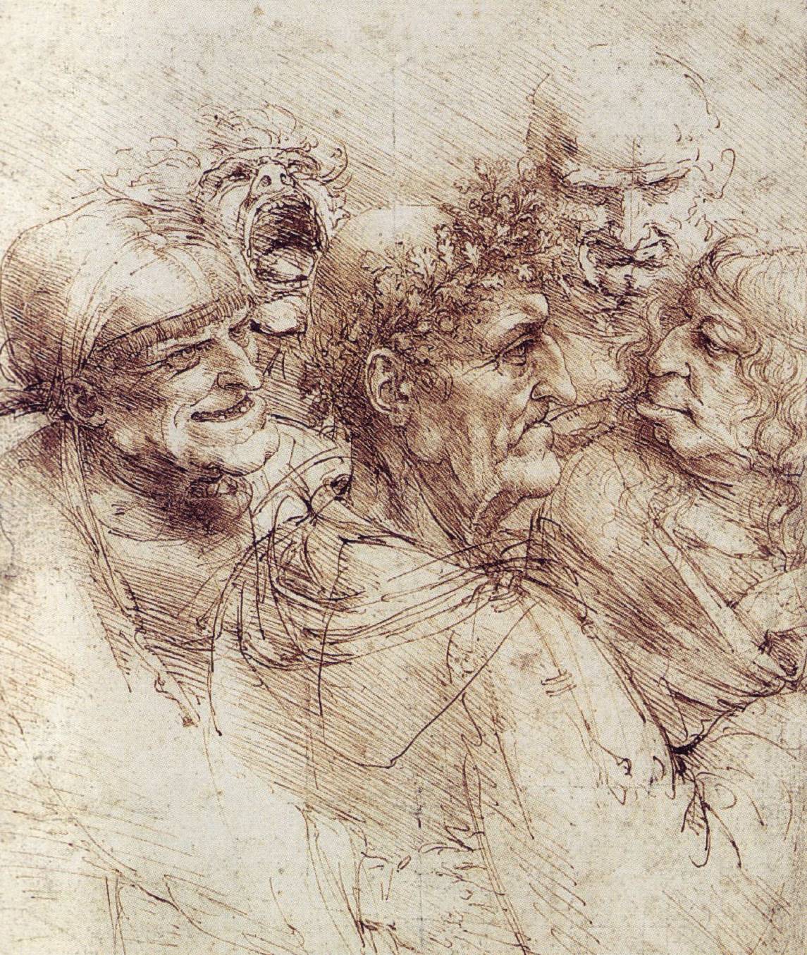
There are lots of familiar drawings in this section, though who is going to object to seeing favourite drawings by Leonardo, Michaelangelo and Raphael in chapter 3, which deals with the Renaissance in Italy? I did learn that Leonardo was left-handed: look at the direction of his hatching for the proof of this. This drawing, from the Royal Library at Windsor, is one of the many illustrations in chapter 3. In many ways, Michaelangelo is the real star of Renaissance drawing, as he often treated drawings as works of art in their own right, rather than as preparatory studies for paintings.


Chapter 4 deals with Italian Baroque drawings. I was struck by the gestural quality of many works in this chapter, such as this one by Guercino. The next chapter shifts to the Northern Renaissance, and it will come as no surprise to know that the most striking drawings in this chapter are those of Durer (including the famous "Great Piece of Turf" from the Albertina in Vienna) and Rembrandt. One of the latter's drawings really struck me the first time I read this book because of its amazing economy of line. This, it seemed to me, was the real magic of drawing: the ability to produce a wonderful work of art with just a few strokes of a pen.

Moving on to France, England and Spain there are a few surprises; or, at least, they were surprises to me when I first found this book. For example, I had never seen Claude Lorrain's wash drawings before (my favourite one, of the River Tiber, is actually in a later chapter). There is also a wonderful charcoal study of a monk by Zurbaran and a typical work by William Blake.


There are even more surprises in the chapters on the twentieth century. I shouldn't, I suppose, have been surprised by Picasso's skill as a draftsman, but his simple contour drawing of a seated nude was a revelation. The quality of line is breathtaking. There is also a wonderful sketch of Fritizi, Paul Klee's cat that was so often his model.


The second section of the book departs from this fairly conventional, chronological treatment of the subject. Instead it deals with what Mendelowitz calls the Art Elements: line, form and value, and texture. Drawings illustrating the use of, for example, different types of line are presented and discussed. Ingres is used to demonstrate the line as a delimiting edge, Raphael the use of value to model form, and Degas the representation of texture. In many ways these three chapters are my favourites in the book, because this is when the huge variety of effects that can be produced with a pencil or a stick of chalk is made most apparent. Even if one just looks at drawings in which line is the dominant element there is a huge range of art, from formal academic work through to abstract art.

The final section deals with the different media that can be used for drawing, though this is rather conventional: metalpoint, pencil, chalk, crayon, charcoal, and ink are the main ones covered. There is also a chapter on imaginative drawing. Interesting though these chapters are, though, it is the first two sections that, for me, really make this book special. It is a massive book, but that didn't stop me reading it cover to cover when I first bought it. Now, I tend to dip in to it for inspiration or just to admire the amazing achievements of so many wonderful artists. It's a shame it's no longer in print, but it is well worth seeking out.

Pencil rating: 5 pencils

16 October 2007

Jonathan WIP, part 1


I haven't done a graphite portrait for a while, so here goes with one of my nephew, Jonathan. I liked the pose, though I'm still not sure if it will make a good drawing because you can't see his eyes. Worth a try, anyway! This is done on Bristol smooth, so far I've only used a mechanical 2B pencil. The hair is going to be a challenge!


Tomorrow I'm going to submit a pen and ink drawing I did a while ago to the Oxford Art Society open exhibition. I've never done anything like that before. It's very scary; it's a society for real, professional artists! But the secretary is a friend of mine, and she twisted my arm. Unfortunately, she's not on the selection committee! I'll let you know how I get on...

11 October 2007

Ink sketches


It's been over a week since I posted. Life's been hectic, mainly because it's the start of a new academic year, with it's seemingly endless number of welcome receptions, induction briefings, and dinners. The college Freshers Dinner can be slightly excruciating, but this year's bunch were fun to chat to. I just wish they would vary the menu; this was my 14th Freshers Dinner, and every year they serve chicken Kiev and profiteroles!


Anyway, mainly inspired by Anita, I've got me a bottle of Noodler's red/black ink. It's a great colour. Are any others worth checking out? These are some sketches from my bedroom. Yes, OK I admit that I sometimes sketch in bed...I'm not sure whether that makes me a very keen sketcher or a very, very lazy one!